The following is a series of items that I designed for a recent wedding, including the save the date card, the r.s.v.p. card, the wedding invitation, and the program.
Lindsey Davenport's design portfolio
5/24/12
Wedding Set
Labels:
Austin,
card,
design,
drawing,
graphic design,
Lindsey Davenport,
pen,
wedding,
wedding invitation
Human Organ Posters
These three posters are satirical advertisements for an imaginary company that sells human organs. The organs are made up of elements from my photographs, drawings, and collages, as well as scanned objects.
Labels:
brain,
collage,
colorful,
composite,
design,
drawing,
graphic design,
heart,
human organ,
kidney,
Lindsey Davenport,
organs,
paint,
pen,
photography,
poster,
satire,
satirical humor
Dog Rescue Design
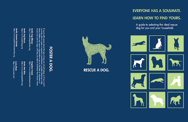
This is an ongoing project through which I am combining my passion for dogs and dog rescue with my love of graphic design. While researching, I found lots of information to help people choose the right pure-bred dog, but very few resources to help people select the right rescue and mixed-breed dog.
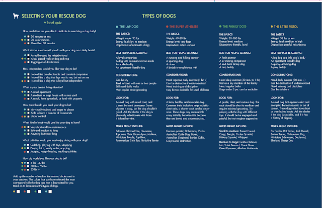
I decided to design a quiz to serve as an aid for people looking to adopt a rescue dog through a shelter or rescue organization. I did so by breaking dogs into four basic types. Following the quiz is a description of each of the dog types, along with information about who they are best suited for, how to identify them, and more. Currently the quiz and information are in pamphlet form, though I hope to design an app soon, as well.
I also created a series of stickers featuring the faces and names of dogs needing homes, as well as the local rescue organization or shelter website where that dog can be found. I then placed the stickers around the city. In the future, I would like to leave pages of stickers laying around in public, with a note telling people to spread them around.
Below are the unfolded pamphlet pages, the folded pamphlet, and the stickers.
Labels:
blue,
design,
dog,
dog rescue,
graphic design,
green,
Lindsey Davenport,
mixed-breed dog,
mutts,
pamphlet,
quiz,
silhouette,
social design,
stickers
5/23/12
Tool Bugs
Tool Bugs are functional, transportable, displayable, and aesthetically appealing, two-in-one robot bug tools. The Tool Bug is a hypothetical product that brings together a number of my favorite things, including household tools, robots, and infusing everyday items with visual interest. Shown below are:
- Four Tool Bugs
- A poster promoting the Tool Bugs
- The cover of a catalog for the Tool Bugs
- A link to the full catalog
Labels:
black,
blue,
book,
bugs,
catalog,
design,
graphic design,
green,
hammer,
innovative,
Lindsey Davenport,
pliers,
poster,
product design,
red,
robot,
robots,
screwdriver,
tools,
wrench
Below is an image of an energy drink label, inspired by the lyrics of rapper K-rino and the 5-hour Energy Drink.
Labels:
design,
energy drink,
graphic design,
K-rino,
label,
Lindsey Davenport,
photography,
product design,
rap,
rapper
The wack rapper meal
Inspired by lyrics from rapper K-rino, this is hypothetical packaging for a seven-piece wack rapper meal. Each food item is named after a particular type of wack, or bad, rapper, and includes a visual example of a current rapper.
Labels:
blue,
design,
fast food,
graphic design,
K-rino,
Lindsey Davenport,
orange,
package design,
product design,
rapper,
southern rap
Educational fork cubes
This brief project involved the creation of four wooden cubes that are both educational and design-conscious. Each cube includes images and information related to one type of fork, including how to identify the fork and what it is used for. The squares below are the images that made up the sides of the cubes.
Labels:
black,
design,
educational,
forks,
graphic design,
green,
Lindsey Davenport,
silhouette,
squares,
white
9/28/11
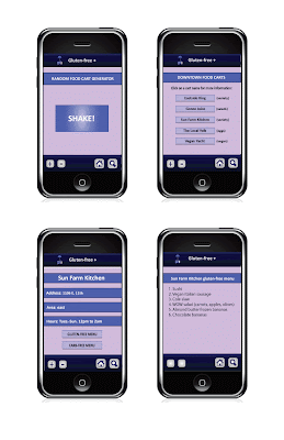
A gluten-free guide to Austin's food trailers (cell phone application)
Independently owned food trailers are a rapidly expanding industry in Austin. For entrepreneurs, they represent an accessible pathway to self-ownership. For customers, they provide a quick and affordable dining option in a rough economy.
This proposed cell phone application is a user-friendly guide to Austin's food trailers for people with gluten and sugar sensitivities, or for those on a low-carbohydrate diet.
The application allows users to narrow their search by location and type of dietary restriction. Selecting a particular food trailer brings up basic information about the business, including their address and the type of food they serve. The user may then to choose to view the menu items that fit their dietary specifications, or return to the list of food trailers.


Labels:
app,
application,
Austin,
blue,
cell app,
design,
food,
gluten-free,
graphic design,
Lindsey Davenport,
purple,
restaurant,
sugar-free
A field guide to corrosion
The idea behind this project was to create an informative, design-conscious guide to an unusual topic. I chose to design a guide to corrosion because it something that I find visually interesting and love to photograph. The book cover is featured below with a couple of sample spreads, as well as a link to view the book in its entirety.

Parking proposal
These are my contributions to a group project outlining a hypothetical proposal to improve the parking situation at St. Edwards University. The group decided on a tiered parking system with a valet option. I was in charge of the implementation portion of the proposal, which included:
1. Color-coded parking lot signs
2. A poster to promote the new parking system
3. A newspaper ad
4. A sign for the valet stand


Labels:
ad,
blue,
buildings,
colorful,
design,
doors,
graphic design,
graphics,
green,
orange,
parking,
parking proposal,
poster,
promotion,
purple,
signs,
silhouette,
St. Edward's University
Subscribe to:
Comments (Atom)


